
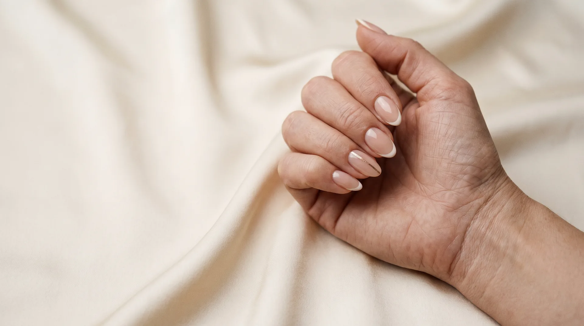
Neutral nails do not have to mean one universal beige. A neutral-looking manicure depends on contrast, coverage, shape and the clothes you wear. For work or everyday use, a comfortable length and a finish you enjoy are often more useful starting points than a trend label.
Choose what “neutral” means to you
| Direction | The effect to discuss |
|---|---|
| Sheer pink | A light wash with some natural nail visible |
| Soft beige | A warmer or cooler shade chosen against your hand |
| Muted taupe | A little more contrast while staying understated |
| Milky ivory | A light, creamy or translucent finish |
| A narrow French | A neutral base with a defined edge |
Match the design to your routine
If you type, work with your hands or prefer a shorter nail, explain that during the consultation. A design photographed on long nails may need different proportions at your preferred length. The right adaptation might be a thinner tip, less art or a simpler finish rather than an entirely different palette.
Workplace requirements vary. This guide does not set a universal rule about which nail products, lengths or colors are permitted in a profession; follow the rules that apply to your own role.
Compare coverage in person
A sheer neutral can show the natural nail beneath it, while an opaque neutral gives a more uniform color field. If you want a particular level of coverage, say so. A bottle or online image may not show that difference clearly.
Read milky white finishes and natural-looking finishes if those are the final choices.
Add one small detail if you want variation
A fine French edge, a single accent or a subtle sheen can change a familiar neutral without making the whole set busy. Agree on the amount of decoration and whether it is an add-on to the chosen service.
Review the manicure menu for hand-care options or the polish-change menu if you mainly want another color. Bring a reference and explain the length, coverage and contrast you want; those details communicate more than the word nude alone.
Three neutral palettes with a different amount of contrast
Start with the effect you want to see at arm's length. Do you want your natural nail to remain visible, a uniform creamy color, or a clearer outline? Those are three different briefs even when all the swatches look quiet in the bottle.
| Palette | How to wear it | What to compare on the swatch |
|---|---|---|
| Sheer rose | A translucent pink on every nail, with no extra artwork. | How clearly the natural edge shows through. |
| Creamy rose-beige | A single full-coverage shade for a more even color field. | Whether the sample leans pink, peach or yellow beside your hand. |
| Muted taupe | A deeper neutral with a visible outline, or one taupe accent with a lighter base. | Whether you prefer its gray or brown undertone with your usual clothes. |
Hold two samples beside the same hand, then beside a sleeve you wear often. A warm beige may feel harmonious with camel or cream, while a grayer taupe can create a quieter pairing with charcoal. These are starting palettes, not rules tied to a skin tone or profession. Pick the combination you enjoy seeing together.
If the color is right but the result feels too strong, compare a sheerer version before changing the whole palette. If it feels too faint, try more coverage or a slightly deeper shade. The color and finish guide explains those choices; the hands-and-feet pairing guide shows how a neutral manicure can work with a richer pedicure.
Published by Luxury Nail & Spa. Updated .