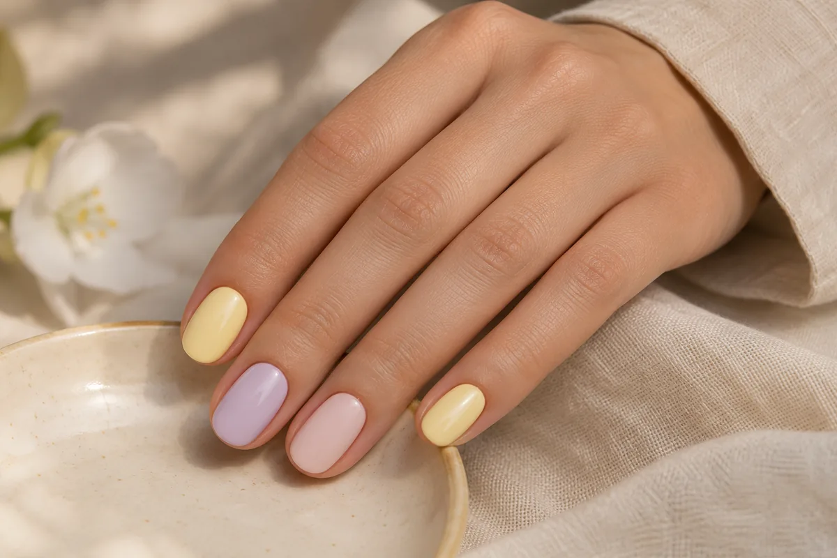
Pastel manicures can be soft, playful or surprisingly graphic depending on the contrast and placement of color. Before choosing a shade, decide whether you want one consistent color, a narrow pastel tip or several related tones across the set.
Choose a color arrangement
| Arrangement | Visual effect | A useful question |
|---|---|---|
| One pastel color | A consistent, simple palette | How opaque is the shade? |
| Pastel French tips | A small amount of color at the edge | How narrow should the tips be? |
| Related tones | Variation within a controlled palette | Which shades should sit next to each other? |
| A neutral with one pastel accent | A quieter set with a focal point | Which nail carries the accent? |
Compare coverage, not just color names
A translucent pale pink and an opaque pale pink may read very differently. The same is true of lavender, mint or soft blue. Ask to see available swatches and explain whether you want the natural nail to show through the color.
Ask which pastel shades and finishes are currently available at the salon.
Use contrast deliberately
A light pastel beside a deep accent creates a more graphic look than several pale tones together. A neutral base with a pastel French tip can keep the color limited to the edge. If the shape is already dramatic, a simpler palette may let that silhouette remain the main feature.
See micro French ideas and choosing colors by contrast and finish for focused comparisons.
Match the design to the chosen service
Tell the salon whether you want a manicure on your current length, SNS or an enhancement set. A pastel design name does not establish the system, appointment time or final price. Confirm any removal, special shape and artwork with the relevant service menu.
For trip planning rather than color selection, read spring nails for a Ponte Vedra Beach getaway. The two decisions work together: a palette you like and an appointment that fits your actual plans.